
Previous | Next
|
|
Contents page Previous | Next
|
Chart display features are those which affect the overall appearance of the Chart. They include those properties and methods that define the colour of the Chart background, Titles and their position, margins, borders and bevels, background images, frame and axis visible, pen colours and widths, 3D, walls, etc.
All of these methods are available via code at design or runtime.
The overall Chart appearance characteristics are grouped into these categories:
General
Axis
Titles
Legend
Panel
Paging
Walls
3D
These are the groupings you will find if you open the Chart Editor at runtime and browse the Chart pages. Other methods affect the 'look' of your Chart. These include Series colours and mark characteristics, individual Axis and Grid display methods and labelling. These will be dealt with in later tutorials dedicated to the specific role of these features.
Add a new Chart to a Form and you will see it displays in 3D with a grey panel background, 2 walls (Bottom and Left), Frame (which defines the Frame of the Chart's plottable area) and a default Chart Title Header "TeeChart".
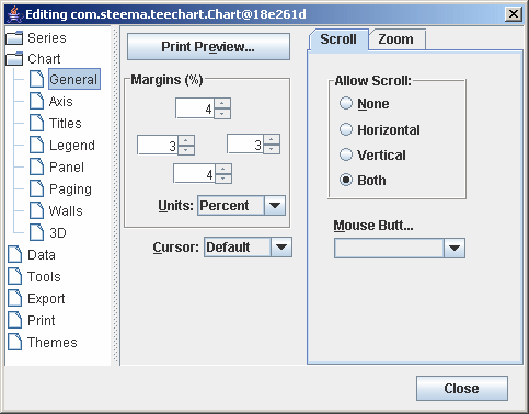
Add a 'Edit Chart' button to the Form as described in the previous tutorial, run the project and click the button to access the Chart Editor. The first page is the Series page, which is empty of Series at the moment and which we'll look at in another tutorial. Select the second Chart tab 'General' to access the General Chart methods page.
General options include Print Preview and Chart Export (See later Tutorials on Printing and Exporting Charts) plus the 3 following sections:
Margins(%)
Zoom
Scroll
See the Zoom and Scroll tutorial for more information about scrolling.
Series' Add methodMargins
Margins are defined as the distance between the Chart Border and the Chart Frame and are expressed as a percentage of the overall dimensions of the Chart Panel.
Moving the spin boxes in the Chart Editor Margins box will show you at design time the effect of changing each Margin.
Runtime methods are:
tChart1.getPanel().setMarginBottom();
tChart1.getPanel().setMarginLeft();
tChart1.getPanel().setMarginRight();
tChart1.getPanel().setMarginTop();
The example applied in the demo project uses an UpDown button:
public void jSpinner1_stateChanged(ChangeEvent e) {
tChart1.getPanel().setMarginTop(((Integer)jSpinner1.getValue()).intValue());
}
Control of the axes is quite an involved area at its highest level of intricacy and is dealt with in greater depth in a later tutorial dedicated to Axis Control. Here we will cover the fundamentals of Axis and Frame display.
The second Chart page holds the methods for defining axis and frame characteristics.
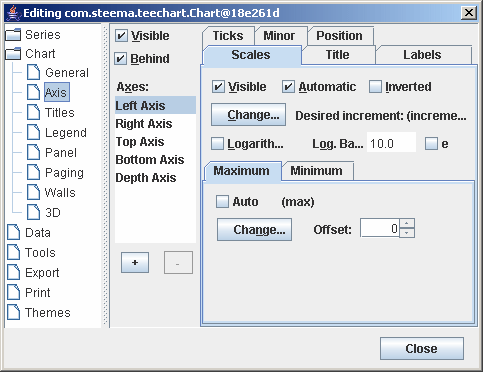
There are 5 axes in the Chart. Left, Top, Right, Bottom and Depth. The Chart Frame displays as a surround to the Chart's plottable area and has no data corresponding features (See BackWall). The Depth initialises by default as not Visible. All other Axes are visible from the moment that a Series is added to the Chart and associated with those Axes (Left and Bottom as default). Custom Axes may be added/removed by using the + and - keys on the dialogue. For a Custom Axis to be visible (as for any other Axis) a Series must be associated with the Axis. See the Axis tutorial for more about Custom axes.
The key methods to enable display of axes and frame are:
Visible
This checkbox enables or disables display of all axes. If the Back wall Frame is visible then
the Chart surround is still visible when the axes are hidden. The result will be the appearance of a larger Chart as no area is reserved for
the axis labels. The Visible method for each Axis (Scales tab) overrides the visible characteristic for each Axis. If you select the Depth Axis in the List then you will note that Depth Axis Scales::Visible is
by default 'not visible'.
Runtime
tChart1.getAxes().setVisible(true);
Axis: Left, Right, Top, Bottom and Depth Visible
Select the Axis that you wish to display or hide in the Listbox and toggle the Visible checkbox on the Scales tab to control the display for that specific axis.
Runtime
e.g.
tChart1.getAxes().getLeft().setVisible(false);
The Titles page of the Chart Editor controls the characteristics of the Chart Titles, Header and Footer.
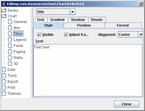
Use the dropdown Combobox to select either Title, Foot, SubTitle or SubFoot. Enter the required text in the Textbox. You may type multiline titles.
Runtime:
The Text method of TChartTitle is a TStrings component. You may add several lines to the Header:
e.g.
tChart1.getHeader().setLines(new String[] {"Welcome to", "TeeChart", "for Java"});
You may then modify lines of text:
e.g.
tChart1.getChart().getTitle().setText("Title revised");
Style Alignment
Alignment refers to the Header (or Footer) alignment with respect to the Chart area NOT the overall Chart Panel. The Chart area is the plottable area of the Chart plus
the Axis Labels and Legend.
Runtime:
tChart1.getChart().getTitle().setAlignment(StringAlignment.CENTER);
Position
Use Position to override the Header or Footer default position and set a custom position (pixels relation to Chart Top, Left).
Runtime:
tChart1.getChart().getTitle().setCustomPosition(true);
tChart1.getChart().getTitle().setTop(30);
Format
Contains the settings for the Header box, e.g. Frame, Background colour, etc.
E.g. Pattern
Patterns refers to both the background of foreground pattern of the Title or Footer box.
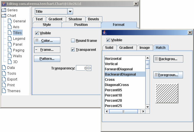
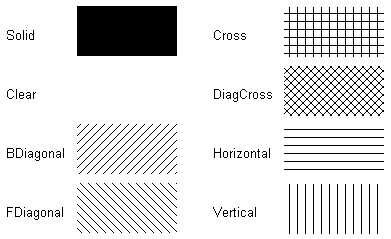
The default is Clear. The selected Pattern will sit behind the Text.
Runtime:
e.g.
tChart1.getHeader().getBrush().setStyle(HatchStyle.FORWARDDIAGONAL);
Text
Contains the Title Text appearance formatting characteristics.
E.g. Font
The Font button will grant access to the Font Dialog window which allows selection of Windows Fonts and definition of style (italic, bold, etc.) and colour.
Runtime:
tChart1.getFooter().getFont().setName("Times New Roman");
tChart1.getFooter().getFont().setBold(true);
Outline
Outline refers to the Frame for the Header or Footer. By default it is set to Visible off. The Outline options derive from TChartPen.
Gradient
Enable/disable a Background Gradient in the Title box.
Legend contents are dealt with in a later tutorial. In the Legend page of the Chart Editor you may define appearance aspects of the Legend. Important initial steps are to know how to control Legend alignment and visible methods, colour, font, frame, shadow, etc..
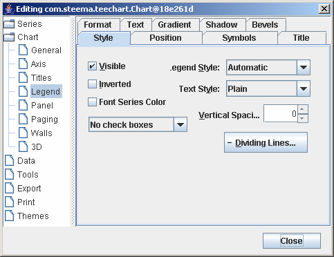
Style
Toggle On/Off Legend display and set Legend display content characteristics (inclusion of Checkboxes, etc).
Runtime:
Example using a Checkbox to control Legend display.
tChart1.getLegend().setVisible(jCheckBox2.isSelected());
Dividing Lines
Used to draw lines within the Legend box between the Legend entries. TChartPen
methods apply.
Runtime:
e.g.
tChart1.getLegend().getDividingLines().setVisible(true);
tChart1.getLegend().getDividingLines().setColor(Color.Blue);
Position
Sets the default display position or enables custom positioning of the Legend. TChart will change the shape of the Legend to fit the location. If the Legend is set to the side (left or right) of the Chart
the contents of the Legend, by default, sit as a list from top to bottom. If the Legend sits below or above the Chart then the Legend contents are placed side by side. The default behaviour may be overridden by using the Resize Chart option and/or by using Custom positioning. See the
Legend tutorial for more about custom positioning
of the Legend.
E.g. ResizeChart
Resize Chart defines whether or not the Chart will leave space for the Legend when it paints. This allows the Legend to be placed within the Chart area.
Runtime:
e.g.
tChart1.getLegend().setResizeChart(true);
%Top position
Defines the Legend box displacement from the top of the Chart Panel.
Runtime:
e.g.
tChart1.getLegend().setTopLeftPos(20);
Symbols
Size and formatting of the Legend symbols.
%Color width
Defines the width of the colour boxes within the Legend.
Runtime:
e.g.
tChart1.getLegend().setColorWidth(40);
Format
Contains the settings for the Title box, e.g. Frame, Background colour, etc.
E.g. Shadow
Methods for the display of the Legend box Shadow. You may define the colour and size.
Runtime:
e.g.
tChart1.getLegend().getShadow().setColor(Color.Yellow);
Text
Text characteristics for the Legend text contents.
Runtime
tChart1.getLegend().setColor(Color.blue);
tChart1.getLegend().getFont().setName("Times New Roman");
tChart1.getLegend().getFont().setColor(Color.yellow);
Gradient
Enable/disable a Background Gradient in the Legend box.
The TeeChart Panel page allows you to set parameters which can greatly enhance the appearance of the Chart. Panel Gradient effects are best seen by monitors that support true colour but some colour combinations on 255 colour screens are very acceptable.
By now you are familiar with TeeChart methods so we won't run through all of them here. Panel methods may be accessed via the TChart component.
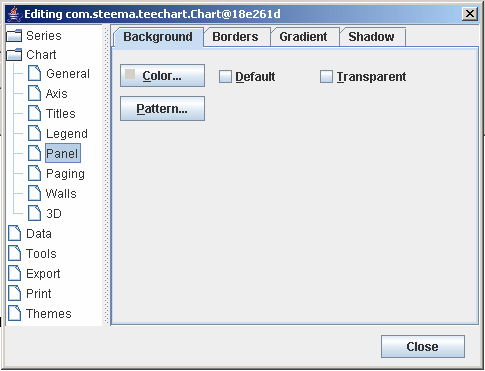
Key areas are:
Background
E.g. Panel Color
Panel colour will paint the whole Chart background with the chosen colour. If you select to view a background Gradient or BackImage they will hide the Panel colour. If you set a Back colour it will replace the Panel colour
within the Chart Frame only.
E.g. BackImage
You may select any bitmap (.bmp) file as BackImage. The BackImage may be centred, tiled or stretched on the Chart Panel, or may be restricted to
the Chart Frame boundaries.
Runtime:
Use BackImage.LoadFromFile to add a BackImage to a Chart at runtime.
e.g.
  if (jFileChooser1.accept(jFileChooser1.getSelectedFile()))
tChart1.getBackgroundImage().loadFromFile(jFileChooser1.getSelectedFile());
Border
You may define Border independently or in conjunction with the Bevel methods. With Border set to Visible True you will obtain a 'sunken' border effect on the outside of the Chart Panel. Mixing Bevel and Border and manipulating Width gives almost any combination of 3D effects.
E.g. Bevel Inner/Bevel Outer/Width
These methods will produce a variety of 3D effects on the Border of the Chart panel. Modify them at design time to see how they affect the Chart border bevels.
Gradient
To define a Gradient you must select a StartColor and EndColor (plus, optionally MidColor) and enable as Visible the Gradient. The Gradient will cover the whole Chart panel. Gradient direction defines the direction of colour
change between Start, Mid and EndColor.
Runtime:
e.g.
tChart1.getPanel().getGradient().setStartColor(Color.Teal);
tChart1.getPanel().getGradient().setEndColor(Color.SkyBlue);
tChart1.getPanel().getGradient().setDirection(LinearGradientMode.HORIZONTAL);
tChart1.getPanel().getGradient().setVisible(true);
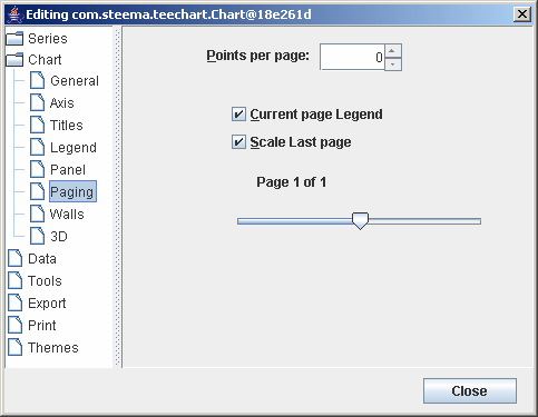
TeeChart paging allows a Chart to be divided into a set number of points per page and for the Chart to be leafed through. See the Paging tutorial for more information.
There are 4 Walls: Left, Right, Bottom and Back, that may be represented in 2D or 3D.
Wall methods are accessible via:
tChart1.getPanel().getGradient().setStartColor(Color.Teal);
tChart1.getPanel().getGradient().setEndColor(Color.SkyBlue);
tChart1.getPanel().getGradient().setDirection(LinearGradientMode.HORIZONTAL);
tChart1.getPanel().getGradient().setVisible(true);
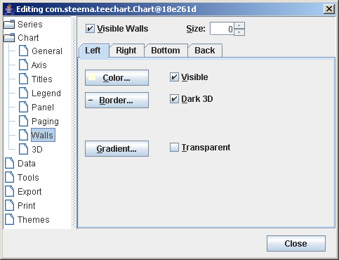
Wall Border
The Border button takes you to the Pen definition for the TChartWall component. This is the same Pen
as that available for many other TeeChart objects.

The visible method enables/disables display of the Border. In the case of the BackWall, where axes are Visible, the Wall Border will be hidden behind those axes so you will only see the result of enabling/disabling the Border if you hide some or all axes (e.g. Make axes Top and Right invisible to see the result of toggling the Wall Border visible method e.g. Chart1.BackWall.Pen.Visible := True;).
See Pen for other characteristics of the Border Pen. You can change these methods to see the result at design time.
3D is extremely flexible in TeeChart Pro. You have the option to display the Chart as:
| 2D | Flat Chart, viewed from front |
| 3D Orthogonal | 3D represented by vectored Lines to indicate depth |
| 3D Native Windows | 3D using 3D Canvas with 360º Chart rotation |
| 3D Open GL | 3D using Open GL Canvas with 360º Chart rotation. When OpenGL is enabled for the Chart, the Editor adds a new page for OpenGL options. |
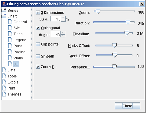
Editor options:
3 Dimensions
Selecting this method (toggling) will change the Chart from a 3D to a 2D Chart in design time and the setting will take effect for runtime.
3D %
Controls the depth of the 3D effect. Changing the value of this method will show you at design time the effect of changing the 3D percentage.
Runtime methods are:
3D visible
tChart1.getGraphics3D().getAspect().setView3D(true);
3D%
tChart1.getGraphics3D().getAspect().setChart3DPercent();
The Orthogonal Option, when disabled, enables Windows Native 3D mode allowing you to Rotate, Elevate and offset the Chart. The Zoom option allows you to bring forward or move away the whole Chart. Zooming internally in the Chart on Data Series is still available at runtime.
|
|
|