|

TeeChart Pro ActiveX 2014
New and Improved Features
Internal canvas classes (GDI and GDI+) have been modified extensively. The default graphic canvas for new charts added at design-time is now GDI+ (IGDIPlusCanvas class) instead of GDI (ITeeCanvas3D class).
Switching from one canvas to another can be done at design-time and run-time through the TChart editor dialog (3D -> Render tab), or manually by code:
tChart1.Aspect.GDIPlus.Active = True
Using the TeeGDIPlus component allows persisting settings, like antialiasing and default text quality.
GDI+ offers several features that cannot be done with GDI (or are done better):
- Color alpha (transparency)
Any color (pen, font, gradient, brush, etc) is now treated as a proper 32bit color with RGB and Alpha components.
The only limitation is pseudo-colors can't be used (vbButtonFace, vbWindowBackground, etc).
Setting a color alpha transparency can be done at design-time using the chart editor dialogs, or by code with programming languages that support the rgba method.
- Line Antialias
GDI+ has line antialias, which produces much better looking charts, without jagged diagonal and curved lines and polygon boundaries.
There's a speed penalty when using antialias that is not a problem unless you're plotting many many points and/or performing animations.
Antialiasing can be changed at runtime by code like:
TChart1.Aspect.GDIPlus.Antialias = False
- Filled Pens
The base IPen interface has a new Fill property (of type IBrush) that is only functional when using the GDI+ canvas. Wide borders and lines (of width 2 or more) can now be filled with textures and gradients.
TChart1.Series(0).Pen.Fill.Gradient.Visible = True
- Multi-color gradients
The GDI+ canvas allows gradients with more than 3 colors.
The base ITeeGradient class has a new Colors collection property. Each color item in the collection has Offset and Transparency properties:
TChart1.Gradient.Colors.Add( 0.3, vbGreen, 50) ' 0.3 means 30%, 50% is transparency
- Smooth texturing
GDI+ uses brush images to fill polygons, rectangles and rounded rectangles with better speed and output results than GDI.
- Transforms
Rotating, translating and scaling elements (like chart titles, legend, series, etc) are enabled using GDI+ transform methods.
Better clipping
When filling polygons with gradients or textures, or when drawing rounded-corner rectangles, clipping should be done manually in GDI (which is not 100% perfect), while in GDI+ this is done automatically and better.
Shadows
In GDI canvas, "smooth" shadows are painted using an intermediary bitmap with a "blur" filter applied. This is a very slow operation, although the output is quite good.
In GDI+, there's another approach to draw smooth shadows that is way much faster with a little loss in quality. Shadows are done using gradients and transparency.
GDI+ speed penalty
There's one thing that is much faster to paint in GDI than GDI+: non-solid pen lines.
Due to this, a big decision has been taken: axis grid lines are now solid instead of dotted:
Chart1.Axis.Left.Grid.Style = psSolid
Grid lines can easily be changed again to be non-solid, using the axis editor dialog.
With all the new changes, the GDI+ canvas is now faster than GDI in many occasions, as soon you use any effect like transparency, gradient fills, or shadows.
GDI is still faster than GDI+ when you dont need antialiasing and any fancy effect, for example when plotting FastLine or Surface series with many many points, but the difference between them is now much smaller, and you can always set back to GDI canvas.
IMarks
ICanvas
- New class methods to set and get the "Alpha" transparency (from 0 to 255) of a given color:
ColorAlpha(AColor: OLE_Color): Byte  // Returns "Alpha" byte from color

ColorFrom(AColor: OLE_Color, Alpha:Byte): OLE_Color   // Sets "Alpha" to color
- New method to draw a round rectangle in 3D (GDI+ only)
RoundRectWithZ(R:ITeeRect; Horiz : Integer, Vert : Integer, Z : Integer)
- New ITeePath interface and TeeCanvas CreatePath method to fill and/or stroke "paths" using the current Pen and Brush/Gradient properties.
Sample:
myPath = TChart1.Canvas.CreatePath
myPath.MoveTo(10,10)
myPath.LineTo(20,20)
myPath.Close
myPath.Draw
- Automatic font quality for GDI+. When a font object "Quality" property is "default" (gpfDefault), the Canvas FontQuality is used.
For GDI+ canvas, the default font quality is now automatic, depending on the font size it is selected as "ClearType" (small fonts up to size 20), and "Best" for bigger font sizes. This gives the best combination of qualities and avoids "blurring" text.
You can always force a specific quality per-Canvas (global to all fonts), and also to a specific font object (ie: Chart1.Legend.Font.Quality)
Themes
Changing the global visual aspect of charts has been improved extensively.
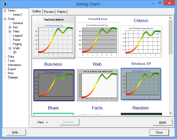
- Improved Themes Editor dialog with a visual gallery of available themes applied to the target chart:
- New "Flat" theme, a minimal theme using "Roboto Th" font (the Android 4.x default font)
- New methods at IThemesList class to apply any existing chart formatting as a theme for any other chart. In other words, any chart can be used as a "theme" for any other chart.
Only formatting is applied. That includes pens, brushes, gradients, fonts, etc.
Also any chart saved as a native *.tee file can be later reused as a "theme", and it will appear at the Themes Gallery.
Chart Gallery
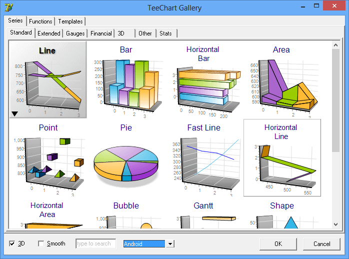
- Redesigned series gallery dialog, with a much better "sub" gallery to visualize different combinations for a single series style.
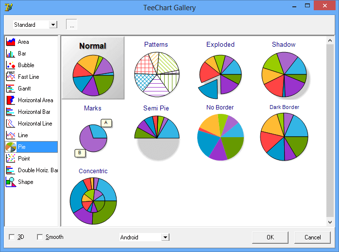
Sub-Gallery for Pie Series:
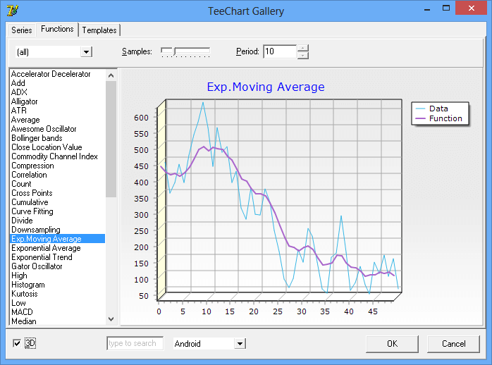
- New TeeFunction gallery, with example demos of each function type.
- When changing a series style using the gallery, styles that can't be applied appear disabled, now this is done internally using a gray-scale filter, which looks better and simplifies the code a good amount.
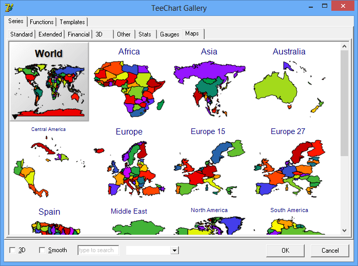
- Improved Series display, for example now the Maps series (IWorldSeries class) show the map at the gallery:
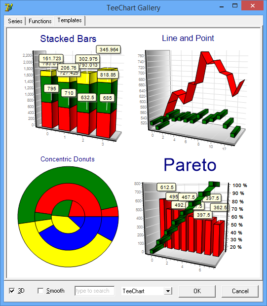
- New "Templates" tab at Gallery, with pre-defined Charts already using Series, Functions, Tools, etc.
For new Charts, a single click automatically adds a ready-to-use Chart:
Exporting
All Series Styles
- Transparency property
The Transparency property (from 0 to 100%) has been moved to the base Series class (ISeries) and implemented for all series styles.
- New Series.Marks AutoPosition boolean property (default True).
- New Series.Marks.SoftClip boolean property (default False).
When True, marks aren't displayed if their associated point is not inside the chart axes space (ChartRect).
Arrow Series
- Fill2D property (boolean, default False)
This new property, when True, draws the same filled arrows in 2D than in 3D.
Previously, in 2D mode arrows were always displayed with thin (no filled) lines.
Bar / HorizBar Series
All Bar styles use now Brush Gradient or Picture properties to fill interiors.
Implemented TickLines property for cylinder bar style in 2D and orthogonal 3D.
Bubble Series
- Automatic calculation of left and right margins
Bubble series now resizes the horizontal axis minimum and maximum values to accomodate for the first (left) and last (right) bubble points sizes, according to their radius.
This is controlled with the Pointer.InflateMargins property (default True).
Note: This only applies when the Bubble horizontal axis scales are also automatic.
Candle (OHLC) Series
Clock Series
New Hours, Minutes and Seconds property (IClockHand type)
The IClockHand class defines how to draw the clock hands with several properties, including border and background attributes, visibility and the percentages of radius, width, height, ending arrow.
New Center property (IPointer type), to display a shape at clock center (by default a circle).
New CustomTime and Time properties. When CustomTime is True, the clock no longer refreshes every second and remains static using the Time property.
Darvas Series
- BoxTransparency property (default 70%)
This property draws the Darvas boxes with transparency, and its independent from the Candle Transparency property.
FastLine series
New DrawStyle property (default flSegments)
When setting it to "flAll", a single polyline call paints all series points instead of painting one by one.
Note: Null values are not considered in "flAll" mode.
FastPen with GDI+ disables antialias.
When using GDI+ canvas, setting FastPen to True will disable antialias to paint just the FastLine series.
This gives much more speed for large quantity of points, without sacrificing quality for all the other chart elements and series.
Gantt series
New Callout property to draw arrows at gantt bar connection lines.
Gauge series
Improved drawing calculations and new ShapeStyle property to optionally fill the gauge background.
Horizontal Bar Series
When showing individual bar values at Legend, the Legend is now inverted to show them in the same vertical order.
New IPointer FullGradient boolean property (default False)
New psDonut style for IPointer.Style property.
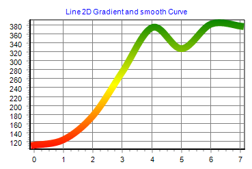
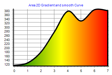
Line and Area Series
- New DrawStyle property (default dsSegments).
Only for 2D and 3D orthogonal view modes. When DrawStyle is "dsAll", the line or area is displayed using a Canvas PolyLine / Polygon call instead of drawing each segment individually.
When DrawStyle is "dsCurve", and only for GDI+ canvas, the line is displayed using a smoothing spline algorithm.
When DrawStyle is not "dsSegments", this allows for example configuring the Pen.Gradient so the whole line uses the gradient colors, instead of using the gradient colors for each segment (segments between each line point), and also using the Pen.JoinStyle property to draw the connections between points.
Pie and Donut Series
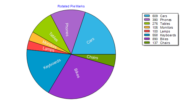
- New property Series1.PieMarks.Rotated (boolean) to display rotated marks (work also with PieMarks.InsideSlice=True):
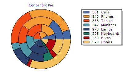
- New value for MultiPie property (Series1.MultiPie = mpConcentric) to display multiple pie series as concentric donuts, in 2D and 3D.
- New PieMarks.EmptySlice boolean property (default False). When True, series marks for empty pie slices (of value 0) will be displayed.
Polar, PolarGrid, Radar, Clock, WindRose and Rose Series
- New AngleLabels property, merges and replaces all CircleLabelsXXX properties.
New AntiOverlap property automatically calculates the best increment between circle labels.
- Horizontal Axis Ticks and MinorTicks are now displayed, when Visible.
Pyramid Series
- Several display improvements (using floating point coordinates to avoid pixel-rounding errors)
- Values at Legend are inverted to vertically align with pyramids.
- Multiple Pyramid series display now at the same "Z" depth position.
Volume Series
- Implemented Transparency support
- Improved calculation of left and right margins when the Volumen Pen is big (wide).
Circled Series
- New CircleBrush property to paint backgrounds using gradients and textures.
(This applies to Circled derived series like Polar, Radar, Rose, Clock, etc)
World Maps Series
- New EurAsia map (combines Europe and Asia)
Chart Control
- New Wall RoundSize property.
Walls (specially the back wall) can now be displayed as rounded rectangles.
- Filters property.
Image filters can be applied to a TChart itself (using the internal canvas buffer Bitmap).
Mouse Wheel
The Chart Editor dialog (General -> Mouse tab) has been enhanced with more options to control what happens when the mouse wheel is dragged.
New ZoomWheel property (of type TMouseWheelStyle) to allow zooming the whole chart (in 3D / Orthogonal modes) by dragging the mouse wheel.
New Zoom.MouseWheel property (of type TMouseWheelStyle) to allow zooming series data by dragging the mouse wheel.
TeeFunctions
New IParetoTeeFunction
This function calculates the cumulative percent (from 0 to 100%) of its source series values.
A new Pareto template at "Chart Gallery -> Templates" dialog, uses this function.
New TCentroidTeeFunction
This function calculates the "center of gravity" XY point of its source series point XY positions.
Centroid position is the average position of all points in the array.
Chart Tools
- New tool TRepaintMonitor is an annotation that paints the current "Frames per second" speed when the chart is being animated or repainted lots of times.
IColorBandTool
- New AllowDrag new property, bands can be dragged using the mouse.
- New OnDragging event. Called while dragging the ColorBand using the mouse.
- New OnResizing event. Called while dragging the ColorBand Start or End edge lines using the mouse.
- New NoLimitDrag boolean property (default True) to allow dragging the color band outside the axis min <--> max limits.
IColorLineTool
- IColorLineTool (and also Start and End lines of TColorBandTool) new property: Annotation. To display text located at line.
New AnnotationValue boolean property, when True it displays the current line value using axis formatting, using the Annotation properties.
ICursorTool
- New AxisAnnotation property, to display the current cursor position near the axis.
- New FullRepaint property (default False). When True, the whole chart is repainted while dragging the cursors.
IArrowTool
- New RotateGradient property. When the arrow gradient is visible, gradient is rotated following the Arrow.Angle property.
IScrollPagerTool
- New Align property, to align the scroller to bottom/right ("saAfter"), or to top/left ("saBefore"), or "saCustom" for custom positioning of the scroll pager sub-chart.
- New NoLimitDrag boolean property (default False) to restrict scroll to main chart axis minimum and maximum.
- New automatic vertical alignment, when using it with "Horizxxx" series like HorizArea or HorizBar.
- New AddSeries and RemoveSeries methods, to customize which series should appear at the scroller chart, now allowing displaying multiple series (as you wish).
- Data changes in the main series are now reflected in the scrollpager chart series.
ILegendPaletteTool
ISeriesRegionTool
- New OriginPen property (IChartHiddenPen) to optionally draw a line at Origin
Chart Axes
New IAxis.SubAxes property (of type TChartAxes collection) allows nested-chain axes that are synchronized and displayed aligned to their parent axis.
SubAxes can be customized with specific Increment (step between labels) and display properties (labels formatting, text, ticks, etc).
At runtime, example:
var MyAxis : TChartAxis;

MyAxis=TChart1.Axis.Bottom.SubAxes.Add
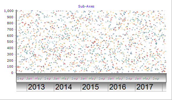
New axis Labels.Position property, determines where to display an axis label in the direction of the axis.
For example, in the sub-axis chart above, the year labels (2013, 2014, etc) are set to Labels.Position = lpAfterTick.
The default Position is "lpAtTick" (exactly centered at the label tick position).
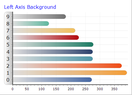
New Shape property of type ITeeShape. When Shape.Transparent is False, the area surrounding the axis labels is filled:
Chart1.Axes.Left.Shape.Transparent=False;
New Texts.Format property, to draw boxes around axis labels, hidden by default:
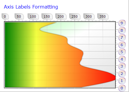
Chart Legend
- New GlobalTransparency property
This property controls the total Legend transparency, including symbols and texts.
The already existing Transparency property is only used when filling the legend background.
Chart Zoom
New Zoom.FullRepaint boolean property (default False).
When true, the zoom rectangle displayed while dragging the chart will repaint the whole chart at each mouse movement.
This allows filling the zoom rectangle with brush color or gradients (for example semi-transparent gradients).
Repainting the whole chart takes some cpu time, but for normal charts this is a very small cost.
Editor Dialogs
- Many editor dialogs have been restructured and improved. There are many more "visual" galleries to customize properties.
- Many modal dialogs have been replaced with embedded versions (modal dialogs aren't suitable for touch devices).
- New EditTool method (at TeeEditTools unit) to show a modal dialog to edit a single tool component.
- TeePicture Filters editor dialog now includes a live color histogram chart updated when changing filter parameters.
Animations
The ITeeAnimate and ITeeAnimation classes have been completely rewritten to provide smooth animations using a separate thread, and with more precision.
Animations are now configured in milliseconds instead of number of frames, using the Duration property.
The ITeeAnimate.Speed property defines the desired maximum number of frames per second (by default 60).
Frames that can't be painted are skipped.
- New ITeeAnimation Timing property.
Defines the interpolation function used to calculate each animation frame.
Values are: Linear, Sine, Square, Cubic. (Back, Bounce and Elastic)
- New TimingStyle property to customize the timing acceleration: atIn, atOut, atInOut
- New StartTime property, in milliseconds.
- DurationFrames function returns the expected number of frames, according to Animate.Speed property (the desired maximum number of frames per second).
- TwoWay boolean property (performs the animation and the inverted animation in the same amount of time)
- Inverted boolean property. The animation performs as opposite.
Existing animations in previous versions (Expand and SeriesAnimation) no longer use Timer components, they internally use the same ITeeAnimate system instead.
A generic "Animation" tool allows creating custom animations, composed of multiple items (individual animations with different properties) and a timeline.
Multiple Animation tools can be added and played simultaneously, each one with specific duration and settings.
Generic animations include NumberAnimation (to animate any integer, datetime or float property) and ColorsAnimation (to make color transitions, for any color property).
New Animations gallery with demos, and editor dialogs for all animation classes.
Animation classes include: Custom, Transform, Series, Expand and Random Points.
ISeriesAnimation
- New support to animate all visible Series on a chart, by setting the Series property to nil to indicate all series should be animated.
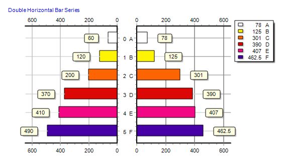
Double Horiz. Bar Series
New Series, similar to Horizontal Bar series to show double values for each bar (one at Left and one at Right).
Line, Area, Point Series (and derived series from ICustomSeries)
- New Pointer.Items property
Series Pointers can now be customized individually, for example:
TChart1.Series(0).asLine.Pointer.Items(12).Color = vbRed

TChart1.Series(0).asLine.Pointer(13).Visible = False
When a pointer item has been modified, changes to the global TChart1.Series(0).asLine.Pointer property will not be used.
To reset a pointer item to its default values, set to nil:
TChart1.Series(0).asLine.Pointer(12) = nil
To remove all custom pointer items completely, call Clear:
TChart1.Series(0).asLine.Pointer.Clear
Surface, ColorGrid, TriSurface, etc:
Palette colors (when UseColorRange is True), now support Alpha (transparency) which gets interpolated when calculating the color
for each cell that corresponds to cell's value.
TChart1.Series(0).asColorGrid.StartColor = TChart1.Canvas.ColorFrom( vbRed, 128) // Alpha from 0 to 255
ICustomTeeShape
The following new features apply to all elements derived from this class (Annotations, Chart Legend, Chart Titles, Series Marks, Organizational series items, Numeric Gauge Markers, TreeMap series items, and many other derived classes).
New property "ShapeCallout", to draw call-out shapes at rectangle sides, with properties to configure the callout (size, position, etc).
ITeeCustomShape new property "Corners" (of type ITeeCorners) to indicate which of the four corners of a rectangle should be displayed using the "RoundSize" property (arcs). Default Style for all four corners is "dsRound".
New Children property (Collection). Multiple sub-items can be displayed inside the same element, recursively.
Each sub-item has individual formatting properties, font and text.
New ChildLayout property. Determines how to align Children sub-items inside the parent boundaries (Top-to-Bottom or Left-to-Right)
New Angle property (rotation degrees from 0 to 360)
General Improvements
- Area series fix, transparency in 3D for the last Area segment.
- Bar, HorizBar series: Cylinder improvements (more smooth look) and better positioning of Marks inside Bars (MarksOnBar property).
- IPen new Fill property.
- ITeeFont.SizeFloat property enables fine graining of font sizes.
- ITeeFont.Brush property, supersedes Gradient and Picture properties.
- New image filters: Sobel and Sepia.
- New IBackImage Bottom and Right properties, to draw Chart1.BackImage at a custom rectangle.
- New ICanvas StretchDrawQuality property (default sqHigh), to eliminate slow calls to SmoothStretch in GDI+.
- New TChart1.SetChartRect(int Left,int Top, int Right, int Bottom) method. To customize the axes rectangle boundaries.
- New AddArrayXYZColor method for 3D Series.
Other internal changes
- IAxisGridPen, changed default pen style to "psSolid" and width to "0" (thin solid lines)
- IZoom.Pen.Width changed default to 3 pixels, for better visibility on big screens.
- Default Font Size for iOS applications, changed from 15 to 11.
- Croatia country added to "Europe 28" map. (Renamed from "Europe 27").
- Improved display of rotated multi-line Text shapes (Marks, Annotation tools, etc).
- More improvements to TeeHTML methods (to display tagged html text inside shapes).
- ISurfaceSeries, HideCells property now defaults to True instead of False.
Deprecated
- ICustomBarSeries AutoMarkPosition, replaced with IMarks.AutoPosition property.
- IPieSeries AutoMarkPosition, replaced with IMarks.AutoPosition property.
- ITeeFont.Gradient.Outline deprecated, replaced with ITeeFont.Outline.Gradient.
| |